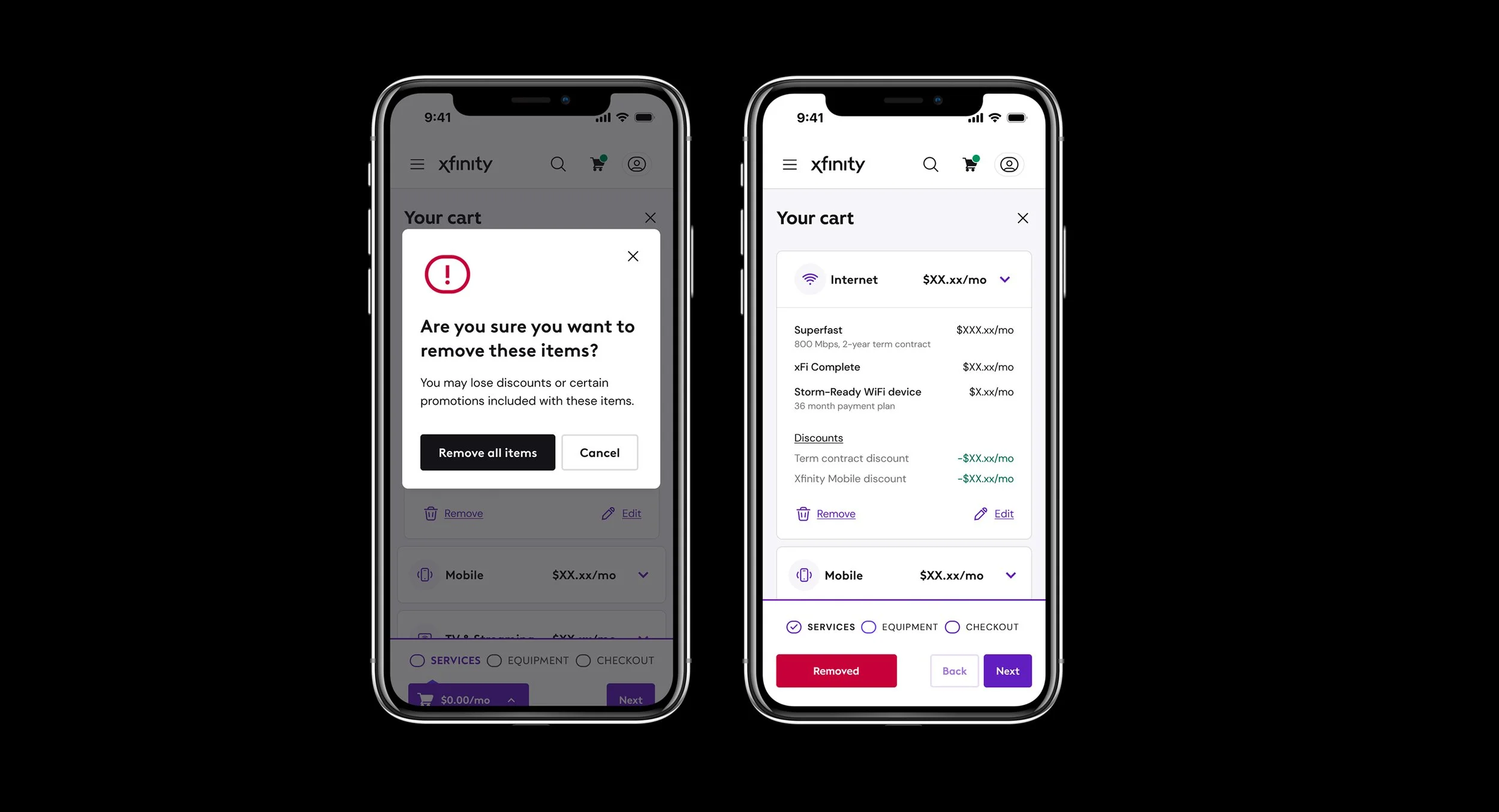
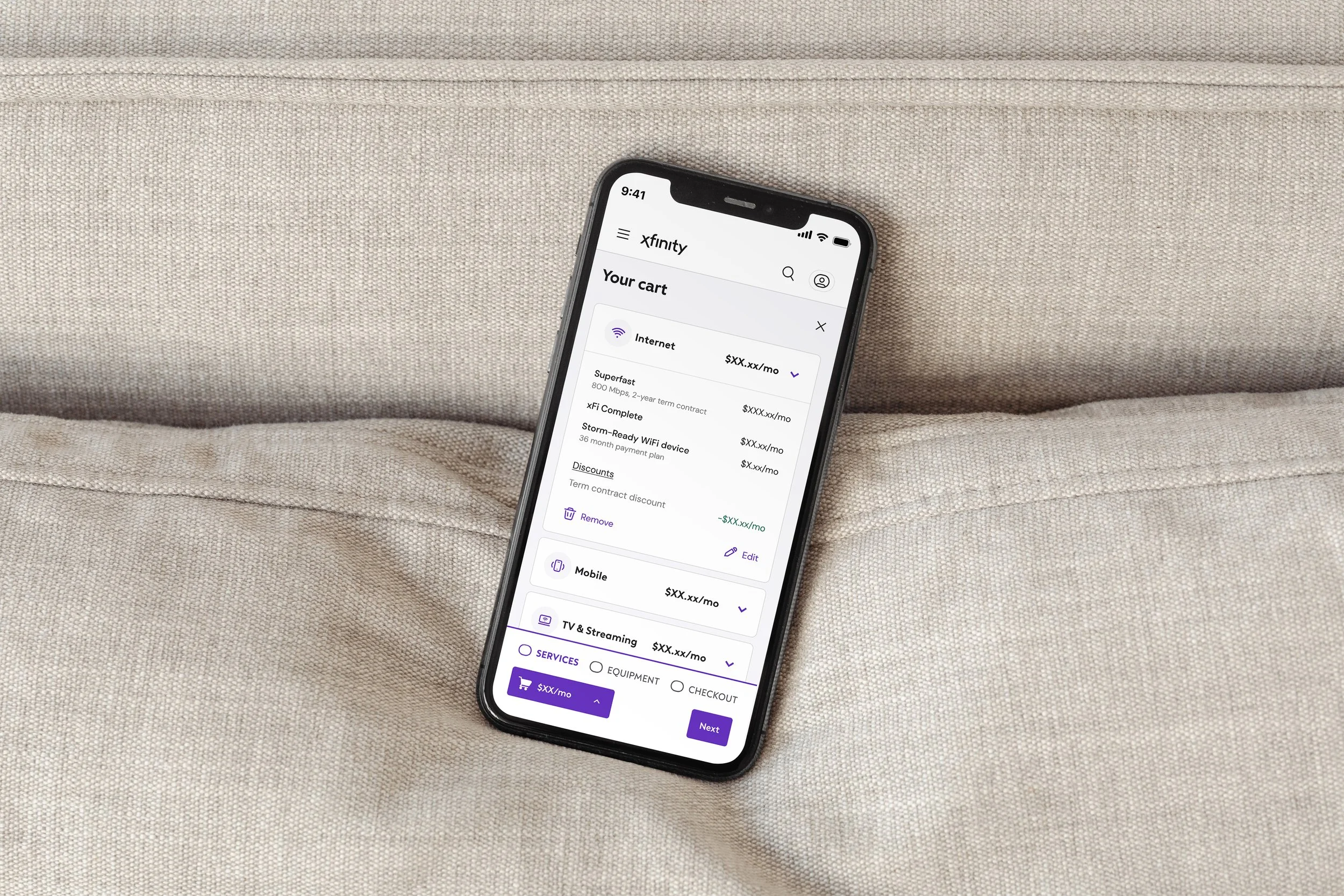
Our goal was to establish trust with our customers by creating a consistent shopping experience through use of clearer naming conventions, hierarchy, and organization of content.
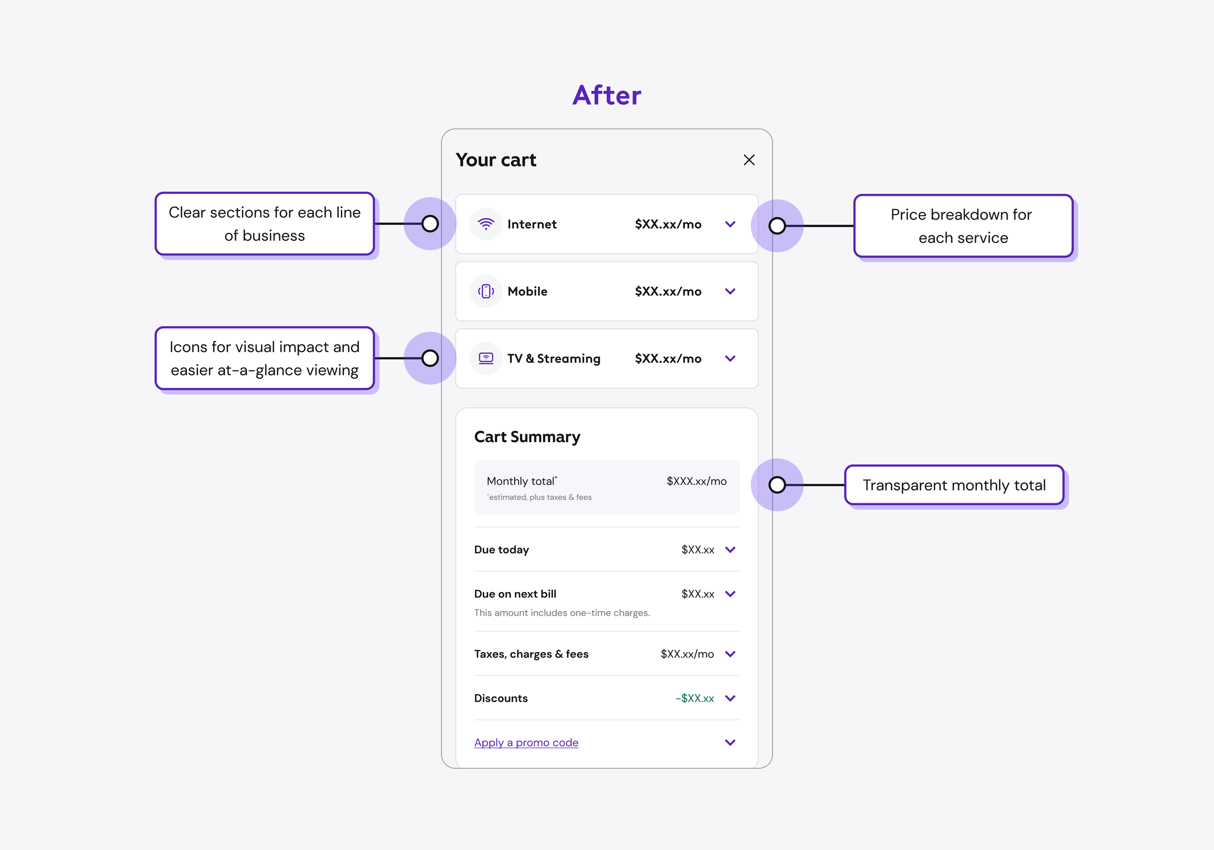
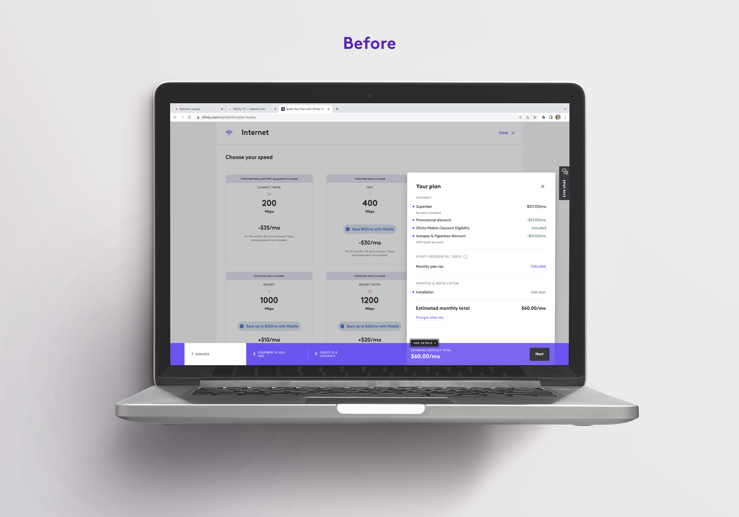
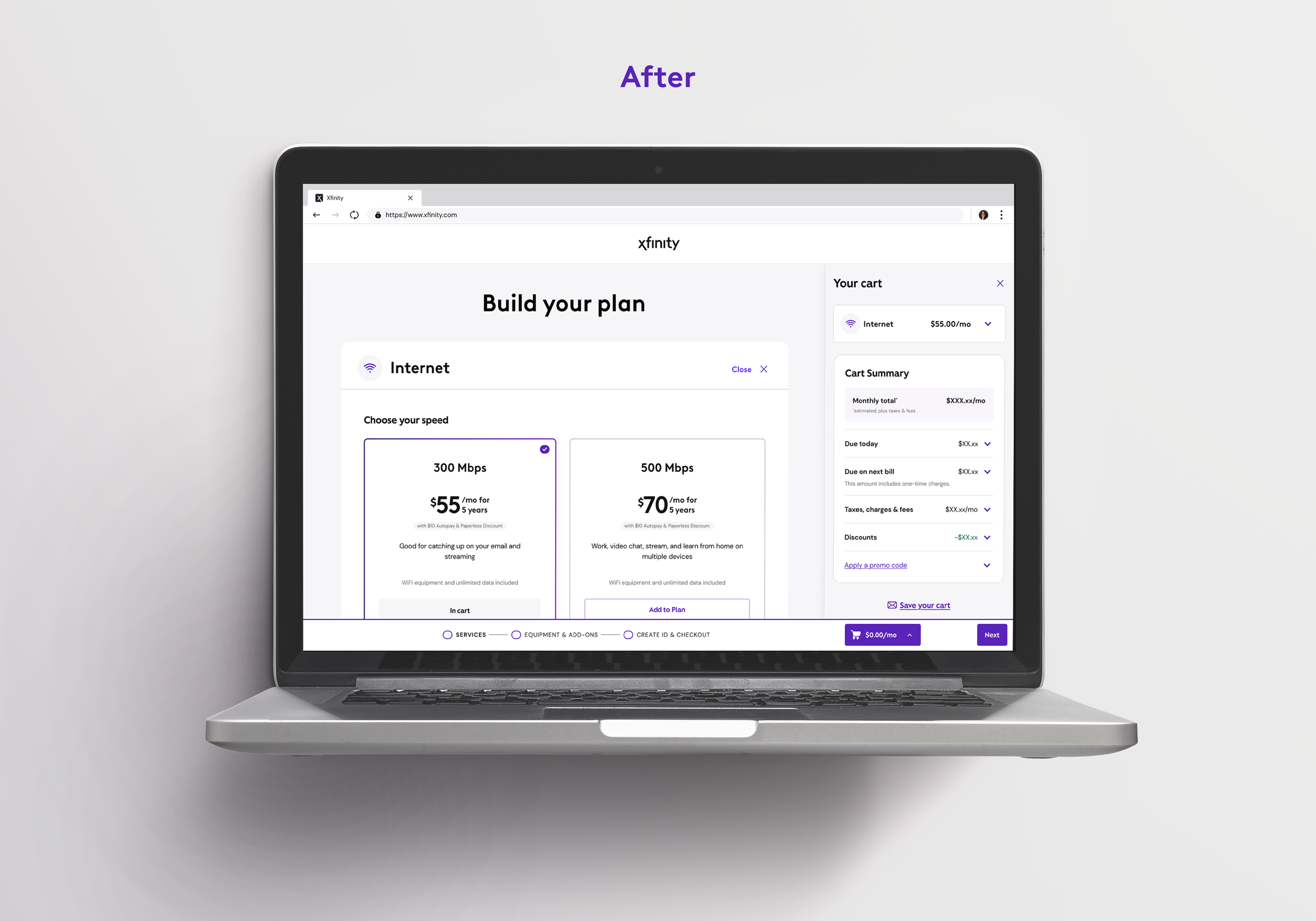
Providing clarity through content organization ensured a clearer and more transparent shopping experience.
Phases
Phase 1
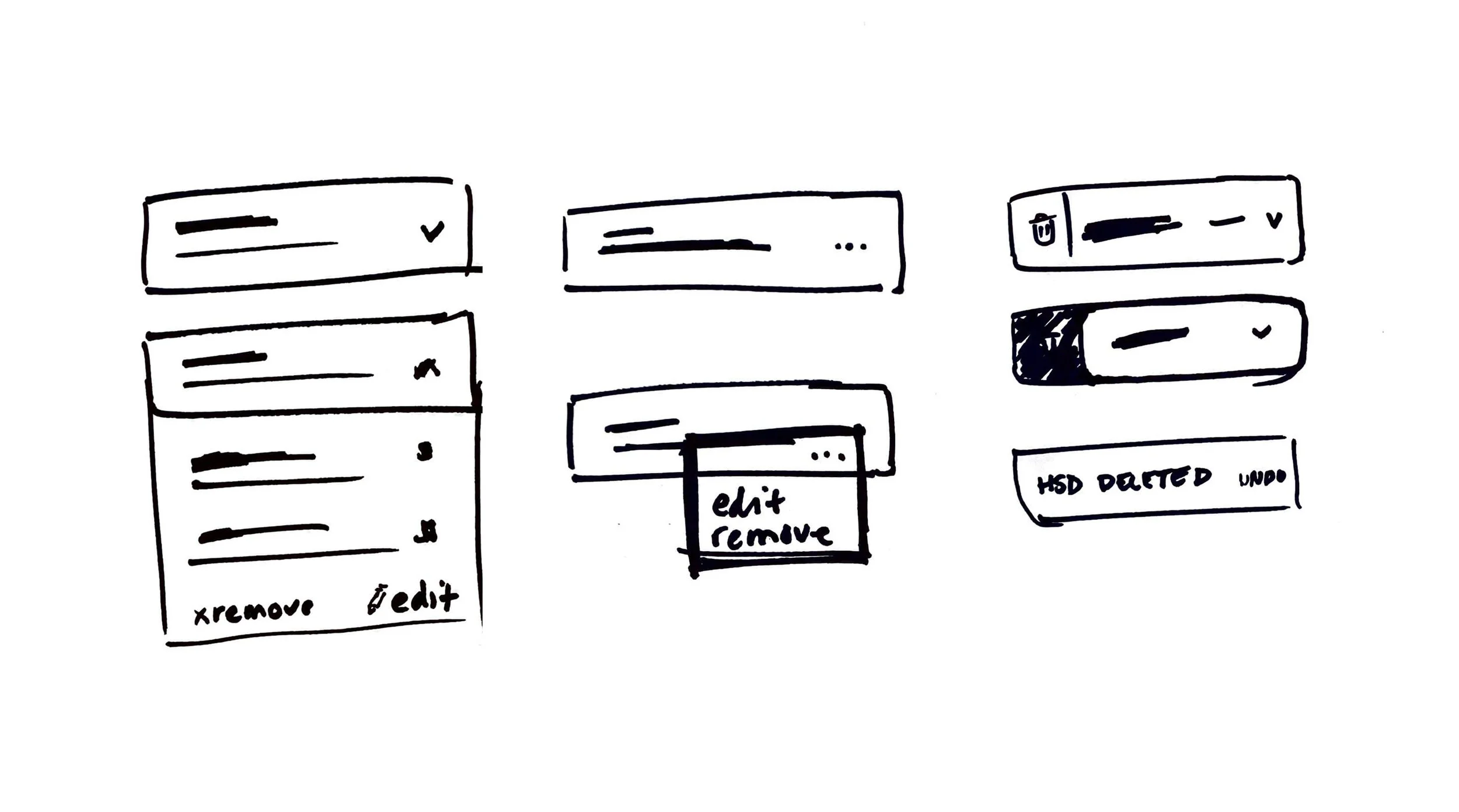
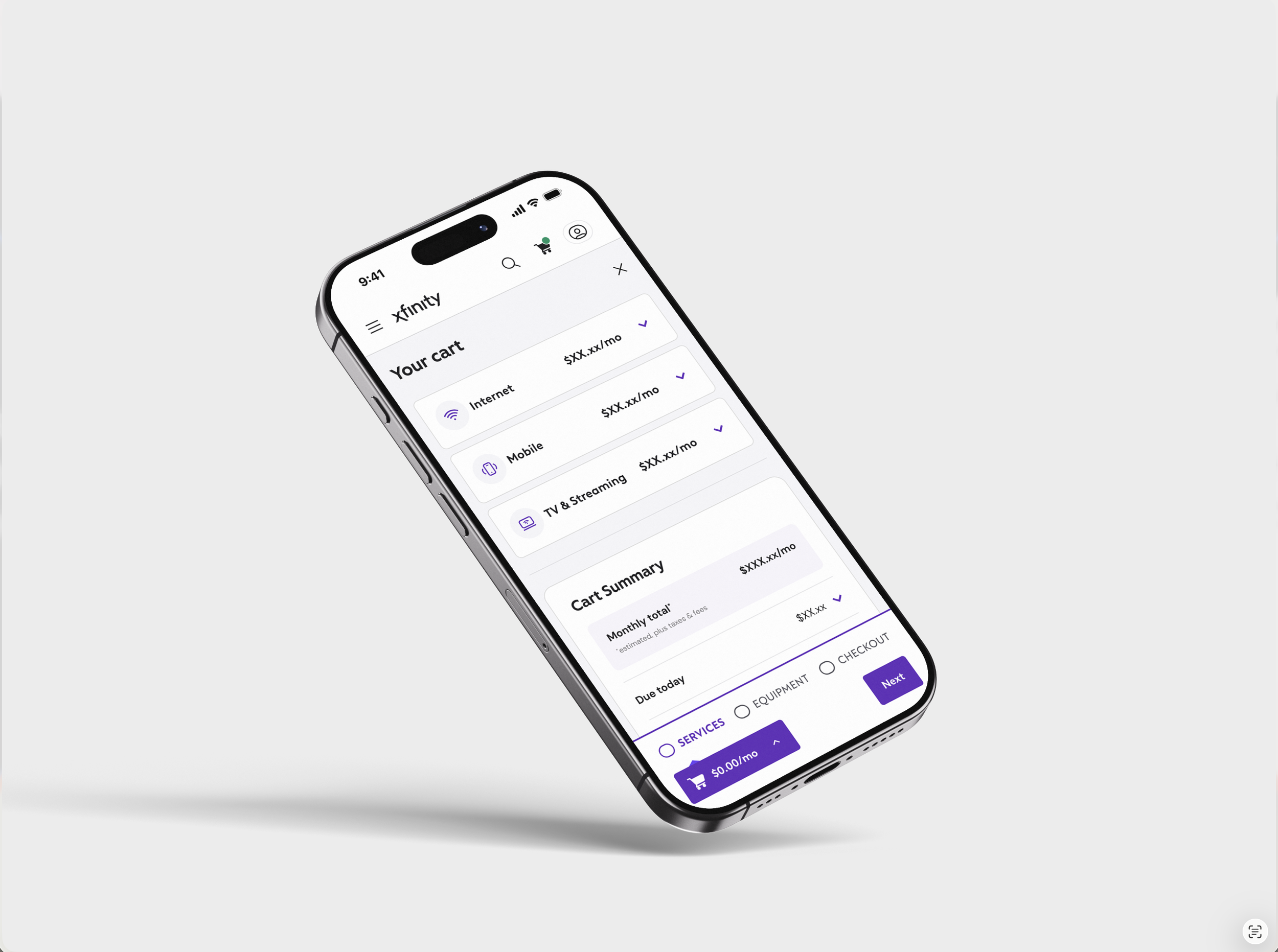
Completed by Senior UX Designer Christianna Wenman. She redesigned a slimmer sticky cart that allowed more space for content and shopping, She created an animation within the sticky cart that expresses a clear action, and, most importantly, implemented an expandable cart that allows the user to continue shopping with the dynamic cart simultaneously visible.
Phase 2
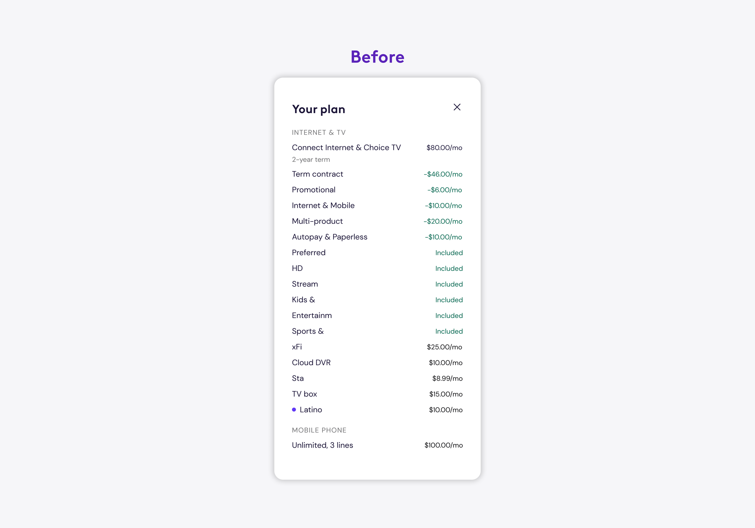
The nitty gritty details. From clearer naming conventions and content hierarchy to determining how we are differentiating charges (monthly, one-time, etc), and rolling out each edge case. With 5 different lines of business, and two different billers, this was no small task. I stepped into the mind of our users, ensuring transparency from beginning to end so that every charge makes sense in order to gain back trust with our customer base.