

Cart & Consent Modernization
User Goal: This refresh was done as a way to provide clarity and re-establish trust with our customers.
Business goal: Increase conversions, decrease friction points and calls to agents.
Team
Product Experience Owner
Hannah Zimmerman
Senior UX Designer
Christianna Breyfogle
UX Designer
Renee D’Angelo
The problem
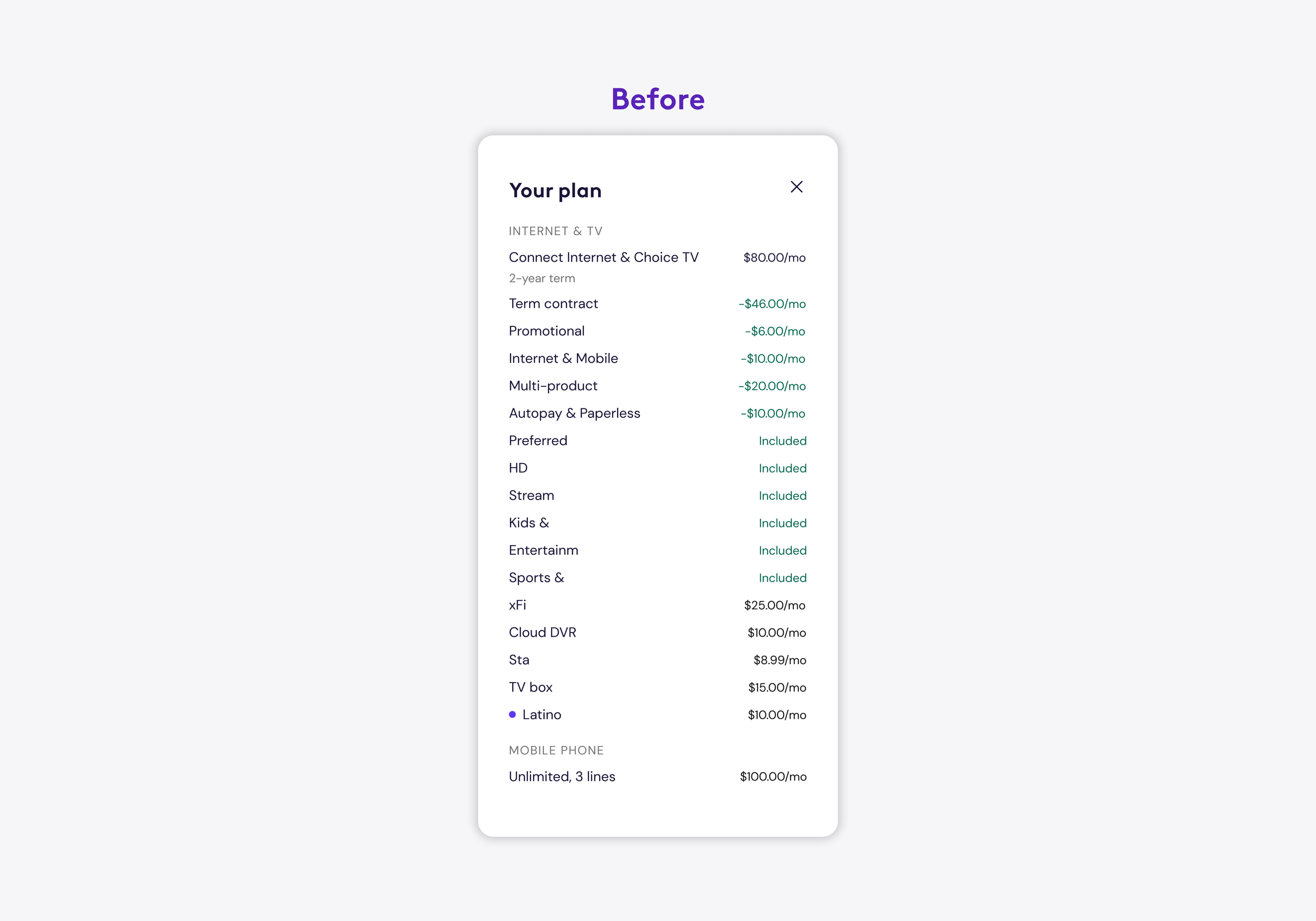
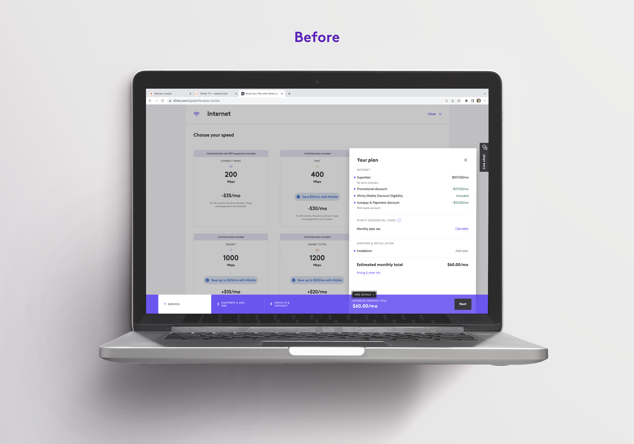
Before this initiative, our cart looked shockingly similar to a CVS receipt with no structure of information. Moreover, we made our customers do a lot of math to understand costs within our cart, and our naming conventions were not clear. This caused the number of calls to agents to increase, and established several friction points within our funnel.
With five different lines of business, and two different billers, the learning curve was high in order to understand our limitations of back-end API's and billing structure —— all before even jumping in the UX. I pushed back many times internally to shift how information could be processed on the back-end, in order to have more flexibility on the front-end regarding information architecture within the UX.
The UX Challenge
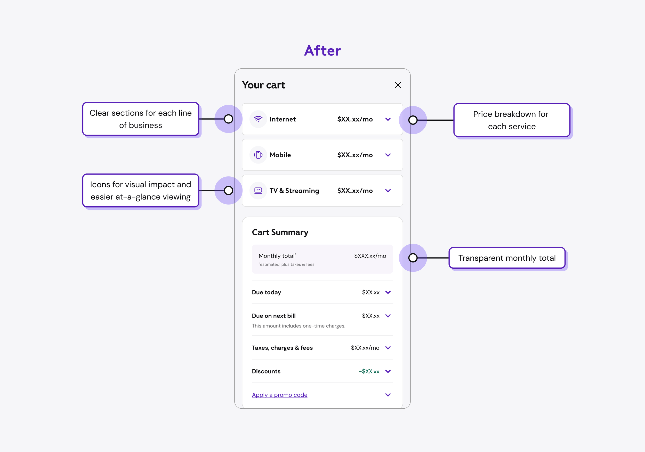
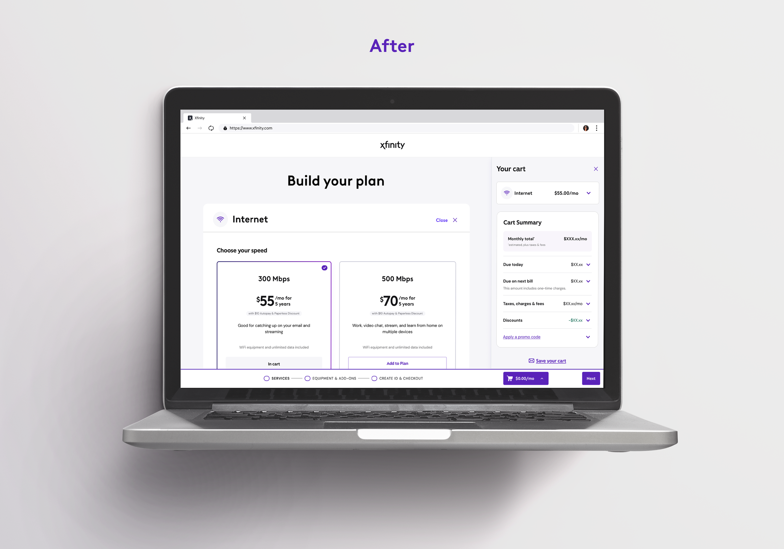
By making a few, very key changes we could drasitcaly improve clarity, customer confidence and re-establish trust with our users.
The Opportunity
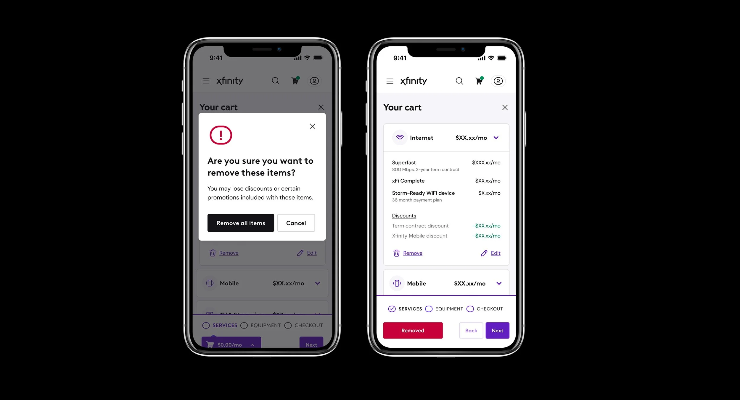
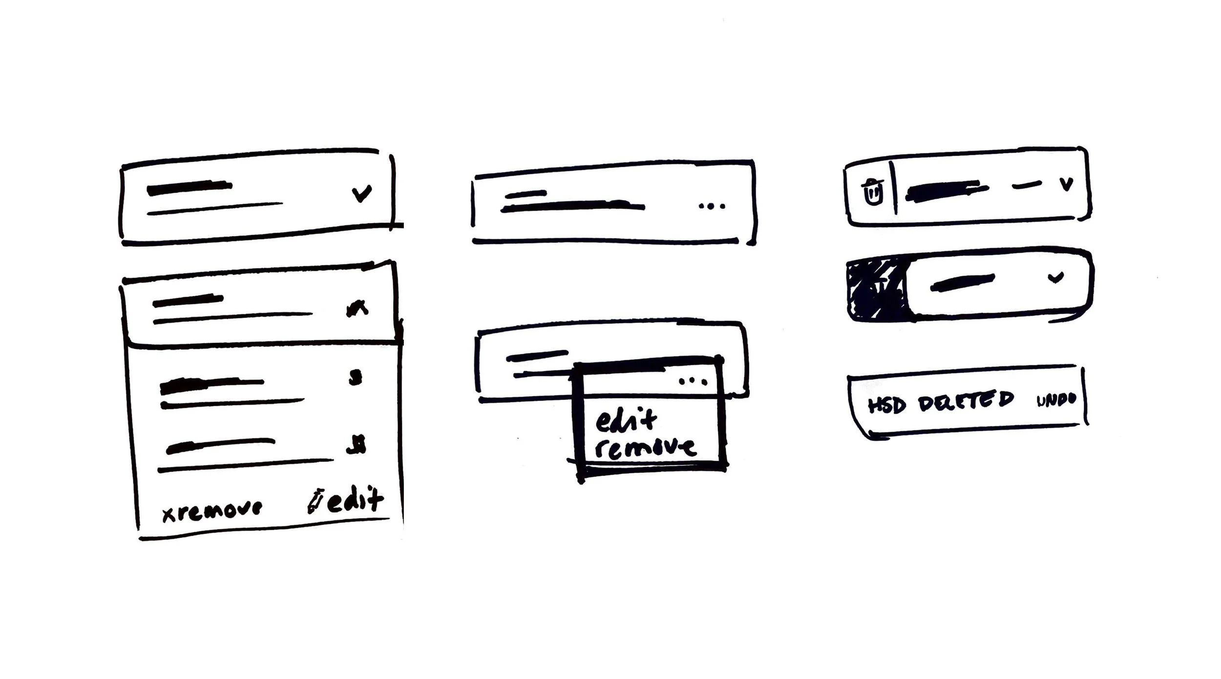
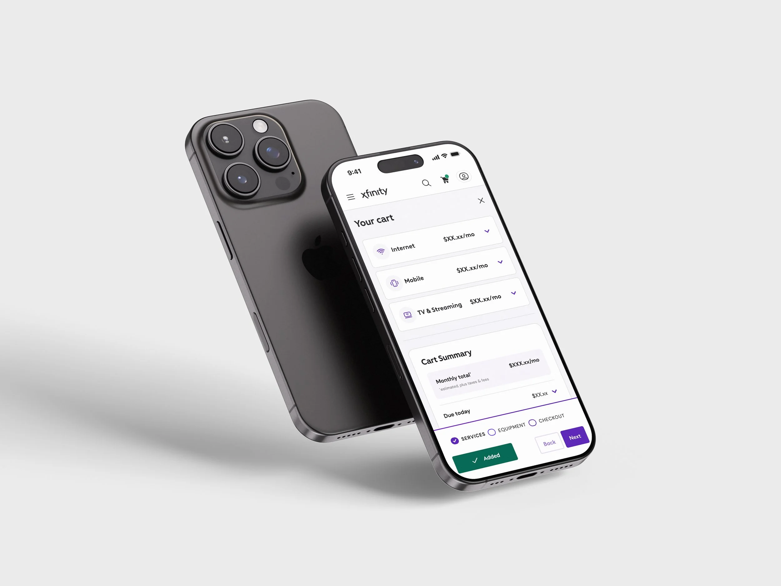
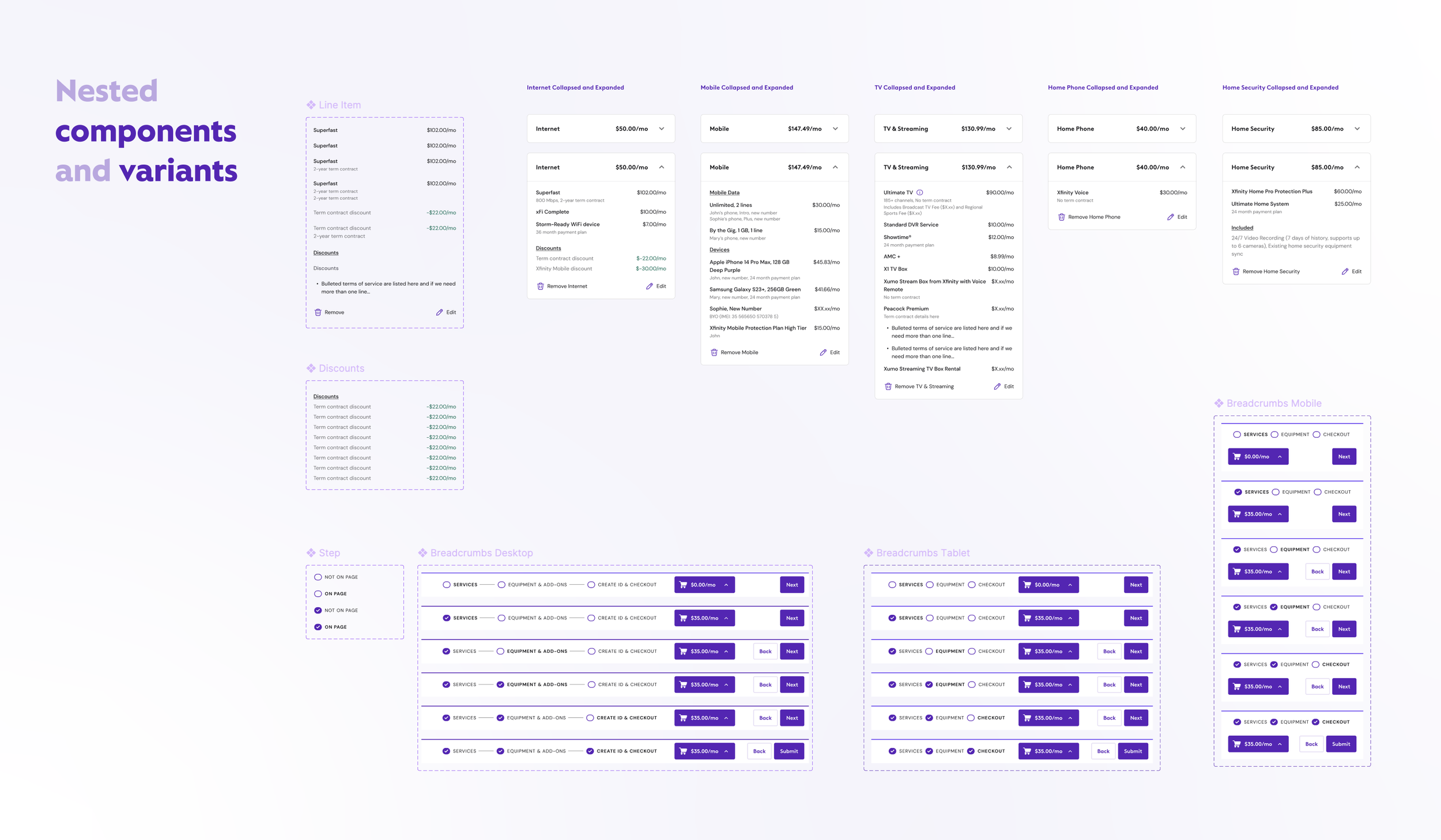
Phase #1 was the redesign of the sticky footer and it’s interactive animations done by Senior UX Designer, Christianna Breyfogle.
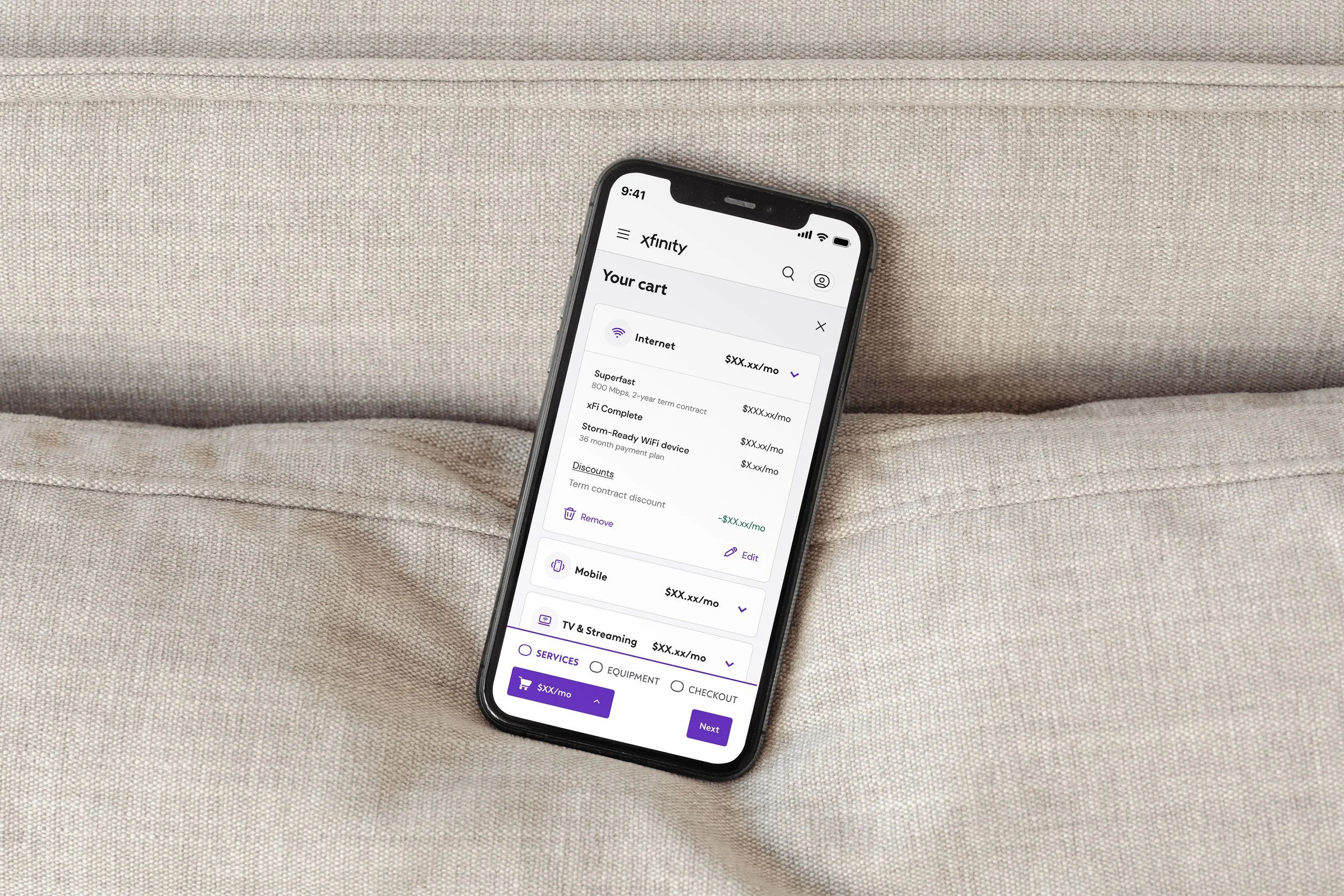
I led and executed phase #2. It was my job to understand the current bill structure, pricing engine model, back-end limitations, and make organizational sense of the cart to be able to better serve this information to customers within their shopping experience. Logically, if they can understand more clearly what they are paying and when, they are more likely to follow through with their purchase.
My Role
✔️ Transparent pricing
✔️ Bill clarity (monhtly vs One-time vs Next bill charges)
✔️ Discount placement shift
✔️ Information hierarchy that matches buy flow steps
✔️ Content Re-organization
✔️ Clearer naming conventions
Trust Checklist